
User experience is now a crucial aspect of successful product design. One feature that has gained significant popularity is Dark mode. This option alters bright white backgrounds to darker colors.
While this change may seem purely aesthetic, it has a deeper impact. It enhances user experience (UX) by addressing user needs and preferences while also providing several practical benefits.
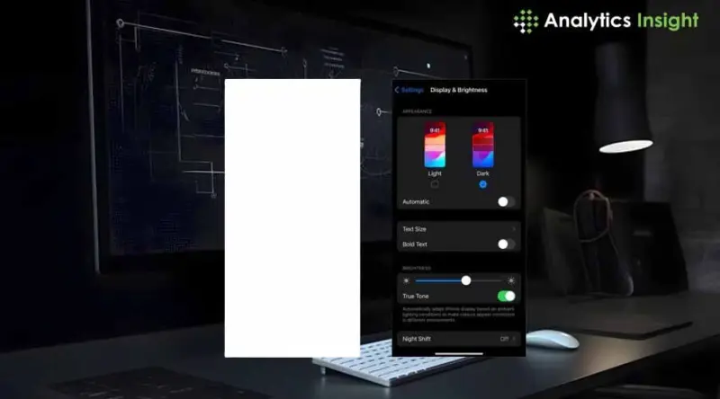
What exactly is Dark Mode?
Dark mode, also known as night mode, reverses the traditional light-on-dark color scheme by using darker backgrounds and lighter text. This concept was developed by designers and developers who often worked in conditions that caused significant glare on their computer screens for extended periods. Today, dark mode has become a standard feature across various apps, websites, and operating systems. Popular platforms like Instagram and Windows have successfully integrated it as a key offering.
Reasons Why Users Love Dark Mode
1. Reduced Eye Strain
This is probably the biggest advantage that dark mode offers-minimized eye strain in dim environments. When the entire screen glows bright white, it can be pretty uncomfortable to use it at night. Dark mode eases the viewing experience, lowering glare and putting less pressure on one's eyes.
2. Battery Efficiency
Dark mode is a game-changer for devices with OLED and AMOLED screens. In these displays, pixels in dark areas are turned off, saving power. This energy efficiency means extended battery life for users, making dark mode particularly appealing for mobile device users.
3. Better Concentration
Dark mode creates a high contrast between the text and background, directing the user's attention to the content. This feature is particularly beneficial in reading-focused applications or interfaces where users need to concentrate for extended periods.
4. Eye Candy
Beyond functionality, dark mode simply looks modern and sleek. Many users prefer the subdued tones for their aesthetic appeal, and designers leverage this preference to create visually striking user interfaces.
Dark Mode and Accessibility
Dark mode is also a valuable tool for accessibility, catering to users with specific vision-related issues. For instance:
Photosensitivity: Dark mode helps in reducing discomfort caused by bright light for people having increased sensitivity to bright light.
Low light Sensitivity: Dark makes sense, mainly for those people who suffer from light-sensitivity headaches such as migraines.
Challenges of Dark Mode
1.Reading Barriers
In poorly designed dark modes, the low contrast of text from the background makes reading the content difficult. Hence, colors and shades would have to be fitted to make the text clearly legible.
2.User Preferences
Not all prefer dark mode; especially during daylight and bright settings, light backgrounds are probably more natural and readable.
3. Adaptation of Designs
Well-designed dark mode needs more man-hours for additional development and design efforts. Besides that, compatibility with brand colors and readability tests are just some of the areas where developers must put in extra time to perfect the overall user experience.
The Dark Mode Future
Considering the popularity of dark modes among users, they must implement them instead of treating them as an add-on. UI/UX will continue evolving in its designs, and that will surely include dark modes with smarter and more adaptable offerings for user customization.
Conclusion
Dark mode is not a fashion; it is actually a pretty good feature that improves the user experience by cutting down on eye strain and requiring less power from the battery, as well as meeting accessibility, needs that really change how we would want to experience digital interfaces. Users can still choose between light mode's eternal brightness and dark mode's sleek comfort, but this simply highlights a very basic tenet of UX: the user comes first.
Join our WhatsApp Channelto get the latest news, exclusives and videos on WhatsApp