
Overview:
Seaborn plots assist analysts in uncovering patterns within complex datasets.
Python visualization tools enhance the interpretation and communication of data.
Selecting the appropriate plot effectively highlights correlations, trends, and distributions.
Data analysis is not limited to mathematical computations. Analysts are expected to interpret raw datasets and convert them into information that stakeholders can easily understand, providing insights into business processes.
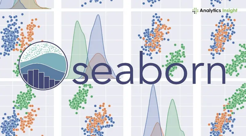
Analysts use visualization tools to easily discover patterns, relationships, and anomalies in data. Seaborn has a nice, easy-to-use syntax. It is one of the top Python data visualization libraries, offering multiple graph types to present statistical data.
As it is built on Matplotlib, Seaborn allows analysts to create visually appealing charts without compromising statistical accuracy, in less time. The following section explains the seven most useful seaborn visualization plots every analyst should know.
Why Data Analysts Use Seaborn for Visualization
Seaborn has become a popular choice for data visualization because of the several advantages it carries:
Simplified Statistical Charts
Seaborn automatically calculates statistical measures such as averages and confidence intervals.
Attractive Default Design
Charts generated using Seaborn appear clean and professional without heavy customization.
Integration with Python Data Tools
The library integrates easily with Pandas, making it ideal for data analysis workflows.
Faster Exploratory Analysis
Knowing which Seaborn chart works the best is important for analysts to conduct in-depth analysis without confusion. It also helps clarify the results. With all these features, Seaborn remains one of the main tools for data visualization in Python.
Top Seaborn Plots Every Data Analyst Should Know
Here are seven Seaborn plots commonly used for data analysis and visualization.
1. Scatter Plot
Scatter plots are a great tool to assess the relationship between two numerical variables. Each point on the graph represents one sample from the dataset. Experts use scatter plots to discover relationships among variables, such as those between sales and advertising or temperature and electricity consumption. Scatter plots remain among the most useful Seaborn charts in Python for exploratory data analysis.
Key Uses
Identifying correlations between variables
Detecting clusters and outliers
Supporting regression analysis
2. Line Plot
Line plots are ideal for showing trends in ordered, structured data. Analysts look at a line plot to read changes in key indicators such as revenue, visitor counts, or stock prices. Seaborn automatically displays confidence intervals and maintains statistical accuracy. Line charts play an important role in Python graph visualization, especially in analyzing data that needs to be read over time.
Key Uses
Time-series analysis
Monitoring trends over time
Forecasting patterns
3. Bar Plot
Bar plots compare numerical values across categories. Analysts frequently use them to compare metrics like sales by region or product ratings by category. Seaborn automatically calculates averages and confidence intervals. These plots remain among the most widely used plots for data visualization.
Key Uses
Comparing grouped data
Displaying category performance
Presenting summary statistics
4. Histogram
Histograms show the distribution of numerical data by splitting values into intervals called bins. Analysts use histograms to see how values are spread over datasets and, at the same time, spot skewness or abnormalities.
Key Uses
Understanding data distribution
Detecting skewed data
Identifying extreme values
Histograms are essential tools in Python visualization for exploratory analysis.
5. Box Plot
Box plots summarize the statistical distribution using quartiles and the median. They also clearly highlight outliers. Analysts use box plots when comparing distributions across multiple categories. Box plots remain powerful seaborn graphs for statistical comparison.
Key Uses
Showing median and quartiles
Identifying outliers
Comparing category distributions
6. Heatmap
Heatmaps represent values using color intensity. Analysts often use them to visualize correlation matrices. For example, a heatmap can show relationships between variables in financial, marketing, or scientific datasets. Heatmaps remain one of the most useful Python graph visualization techniques.
Key Uses
Visualizing correlations between variables
Identifying strong relationships quickly
Simplifying large datasets
7. Pair Plot
Pair plots display relationships between multiple variables simultaneously. The chart creates scatter plots for every variable combination. This visualization helps analysts identify correlations across datasets of different features. Pair plots represent a powerful seaborn visualization technique for large datasets.
Key Uses
Exploring multi-variable datasets
Detecting correlations quickly
Supporting exploratory data analysis
Tips for Better Data Visualization with Seaborn
Using visualization tools effectively improves data interpretation.
Clean Data Before Plotting
Incorrect or missing values may distort visualizations.
Select the Correct Chart
Different datasets require different visualization methods.
Use Clear Labels
Titles and axis labels improve chart readability.
Avoid Overcrowded Visualizations
Simple charts communicate insights more effectively.
Conclusion
Knowing which seaborn plot is most effective is a valuable skill for data analysts, since visualization is a powerful way to highlight key aspects of a dataset. A number of analyses rely on visual tools such as scatter plots, heatmaps, and box plots to identify and understand patterns that are not obvious in numeric grids. Besides knowledge of some of the best Seaborn plots, it is a good idea to continue using Python for data visualization, as this is an effective way to strengthen analytical skills and decision-making.
FAQs
1. What are seaborn plots used for?
Seaborn plots are a great help in visualizing statistical patterns, correlations, and distributions in data.
2. Why do analysts prefer Seaborn for visualization?
Seaborn simplifies the process of statistical plotting and can produce good-looking charts with minimal code.
3. What is the most commonly used seaborn plot?
The most common graphs, including scatter plots and heatmaps, are among the most popular seaborn graphs.
4. Is Seaborn better than Matplotlib?
Seaborn is based on Matplotlib. They complement each other, and Seaborn offers much neater solutions to statistical visualization.
5. Do data analysts use seaborn visualization frequently?
Definitely. Seaborn is the first choice for many analysts in exploratory data analysis and reporting.