
From Atari to the Zemmix, every console has had a brand identity, and many are instantly recognizable. Microsoft is no stranger to this, as for the past 25 years, the Xbox console and its successors have had a visual identity defined by two things: the color green and orbs.
2005: Behold, the orb
By 2005, the Xbox had established itself as a competitor to Sony and Nintendo, and it was time for Microsoft to introduce the next-generation Xbox 360 console. A major evolution of the hardware--if we ignore that little Red Ring of Death issue that plagued it--the Xbox 360 brought better graphics, wireless controllers, and modular upgrades with its optional HDD add-on. The new logo reflected this push to bring high-tech hardware to the market, simplifying the text and throwing a detailed "X sphere" into the mix that referenced the new home button on the controller.
The Xbox 360 console logo also ponders the orb
We'd also see a change with the official Xbox 360 logo, as the new orb was designed to grab your attention with its central placement, while the official Xbox logo text was joined by a "360" that complemented the new grey tones present in the symbol.
2010: The orb evolves
By 2010, the Xbox logo underwent a smaller transformation as the current generation of gaming consoles entered its second half. The logo with an elongated line through the "B" remained, and the lime-green color was subtly lightened, but the Xbox sphere was refined to be even more detailed with its subtle gradient shades, resulting in a very modern icon. Think of it as going from DVD to Blu-ray in the orb department.
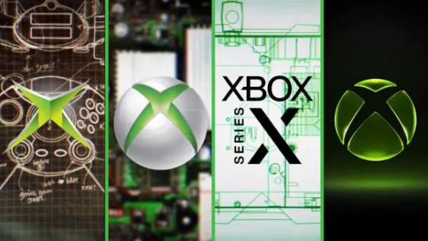
2012: Too 3D, back to 2D
As the 2010s began to pick up pace, Microsoft decided to scale back the complexity of the Xbox logo, simplifying it back to 2D. The Xbox sphere shaved off its colorful metallic accents, but it was still recognizable as a console icon. The other big change was the shade of green used, as the Xbox logo adopted a darker tone while retaining the same font.
2013: Wait, too far, let's go back
A year later, and Microsoft flip-flopped back to its 2000s-era Xbox logo--kind of. While the Xbox text remained the same, the 3D Xbox orb was back. It wasn't as detailed as its 2010-2012 version, but ahead of the Xbox One console launch, it was still a distinctive part of the console's identity--even if Microsoft's senior leadership envisioned a future where gaming wasn't the core focus of the new console.
The Xbox One console logo doesn't do the machine any favors
As for the Xbox One logo? It went back to a horizontal design, using the dark green of Xbox and its icon, and complementing it with a "One" that maintained the dark grey color introduced in the Xbox 360 generation.
2019: Paint it black
After some dark times during the Xbox One era, the console had started to turn a corner. Ambitious plans were in place to acquire various developers to build a portfolio of first-party studios, Xbox Game Pass was well-received after launch, and the backward-compatibility program was a hit with console owners. A year before the launch of the Xbox Series X|S consoles, a new logo was whipped up for the Xbox brand.
This time, Microsoft was taking a page from the Rolling Stones and painting it black: a simple 2D logo with the Xbox sphere on top and the familiar text logo centered below it. Gone was the distinctive green, replaced with a simple lack of color--perhaps a portent of things to come during the turbulent early half of the 2020s for Xbox, as it spent billions on acquisitions and went through years of anemic first-party game releases.
The Xbox Series X|S console logo keeps things simple, shoehorns in extra text
The most corporate of the Xbox brands, the official Xbox Series X|S logo doesn't have much personality. It keeps the font intact and wedges in a "series" to remind you which console you're looking at, but being devoid of color doesn't make it a standout in the long graphic design history of Xbox.
2026: Finally, some personality
It's 2026, and big changes have taken place at Xbox. Phil Spencer is gone, with the division now being led by new Xbox president Asha Sharma and chief content officer Matt Booty. Gone is the minimalist design of previous logos, as it has been replaced with a symbol that returns to the trademark green of Xbox. Other subtle touches allow it to feel futuristic, as the translucent green now pops thanks to a touch of depth.
Continue reading on publisher's website