

New Delhi: The Godrej Industries Group has recently been in the limelight following the introduction of its new corporate logo promptly leading to a frenzied debate in the social media. What was supposed to be an indicator of a new dawn in the company has cast doubt on originality and inspiration of design.
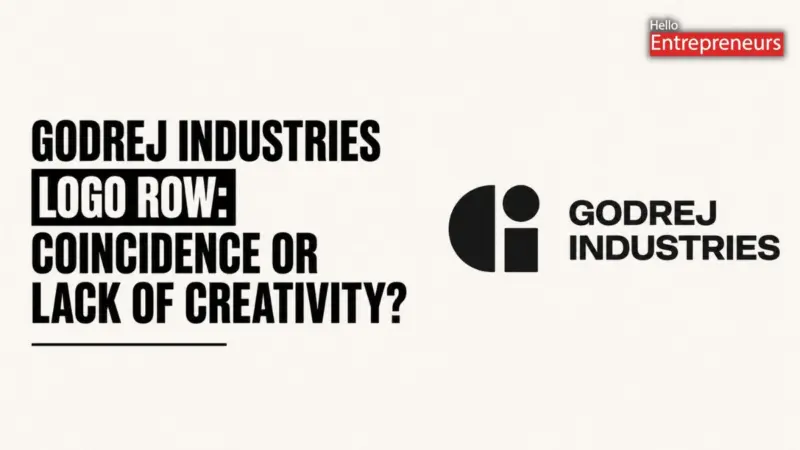
Mumbai-based conglomerate launched a new brand identity as part of an overall business reset. This entailed a plain geometric “GI” symbol, which was designed in-house by the company. The new identity was to be primarily corporate in nature, used in communicating with the investors, media and other partners and not to be used as an alternative to the familiar Godrej logo that it uses on its products.
But shortly after the launch, social media users started to note that the new GI mark and logos resembled other brands. There were numerous comparisons based on similarity to the branding of an Australian agency known as Guerrilla and some other companies in different industries. The online debate was further ignited by some users who even referred to the designs as being almost the same.
It was not a single comparison anymore. It brought out a broader debate regarding current trends in logo design, particularly, the increased use of minimal and geometric forms. As researchers and the users mentioned, the more brands resort to simple forms of design, the more difficult it becomes to make something that will feel unique.
Godrej Industries defended itself in reaction to the criticism. The company made it clear that the new GI symbol is not to be used as an alternative to the traditional Godrej logo. Rather, it is a corporate identifier which will be present forever alongside the core brand name. The method was required following the restructuring of the Godrej Group into the two different businesses in 2024, and it was necessary to develop a unique identity of each.
In response to the similarity issues, the company said that geometric designs tend to resemble each other since they are constructed of simple shapes. The company claims that such overlaps are typical in industries and regions. It further stated that it was a meticulously designed design that was determined due to its simplicity and compatibility with the already established Godrej branding.
Nevertheless, it is the controversy that has brought bigger questions to the branding and marketing fraternity. Among the important issues is the question of whether firms should use exclusively the in-house staff when making major creative decisions such as the design of logos. Although in-house teams can be faster, cheaper and have greater control, there are those experts who think that external agencies can offer a new perspective and more effective challenge of ideas.
According to industry experts, the process of developing a brand identity is not necessarily about coming up with the visual appeal. It also entails knowledge of the history of the company, its values and future objectives. Some feel that due to this, an external perspective can be used to prevent designs which may accidentally resemble the existing ones.
Regardless of the criticism, the new GI mark will probably continue to be a corporate logo of Godrej Industries. And still the incident has become a case study to the industry, and indicates not only the ills of current logo design, but the need to balance creativity and originality.
After all, the project that initially started as a simple rebranding exercise, has gradually turned into a larger discussion of design trends, the creative process, the way brands retain their uniqueness in the constantly expanding visual world.